The U.S. Economy in Graphs
18 charts that explain the American economy
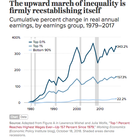
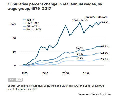
 Click to enlarge
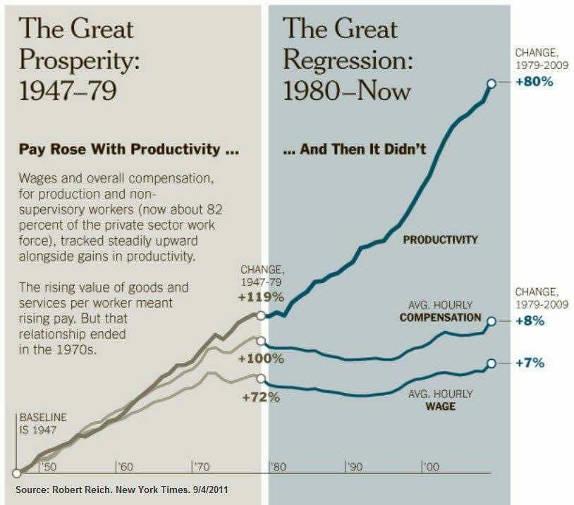
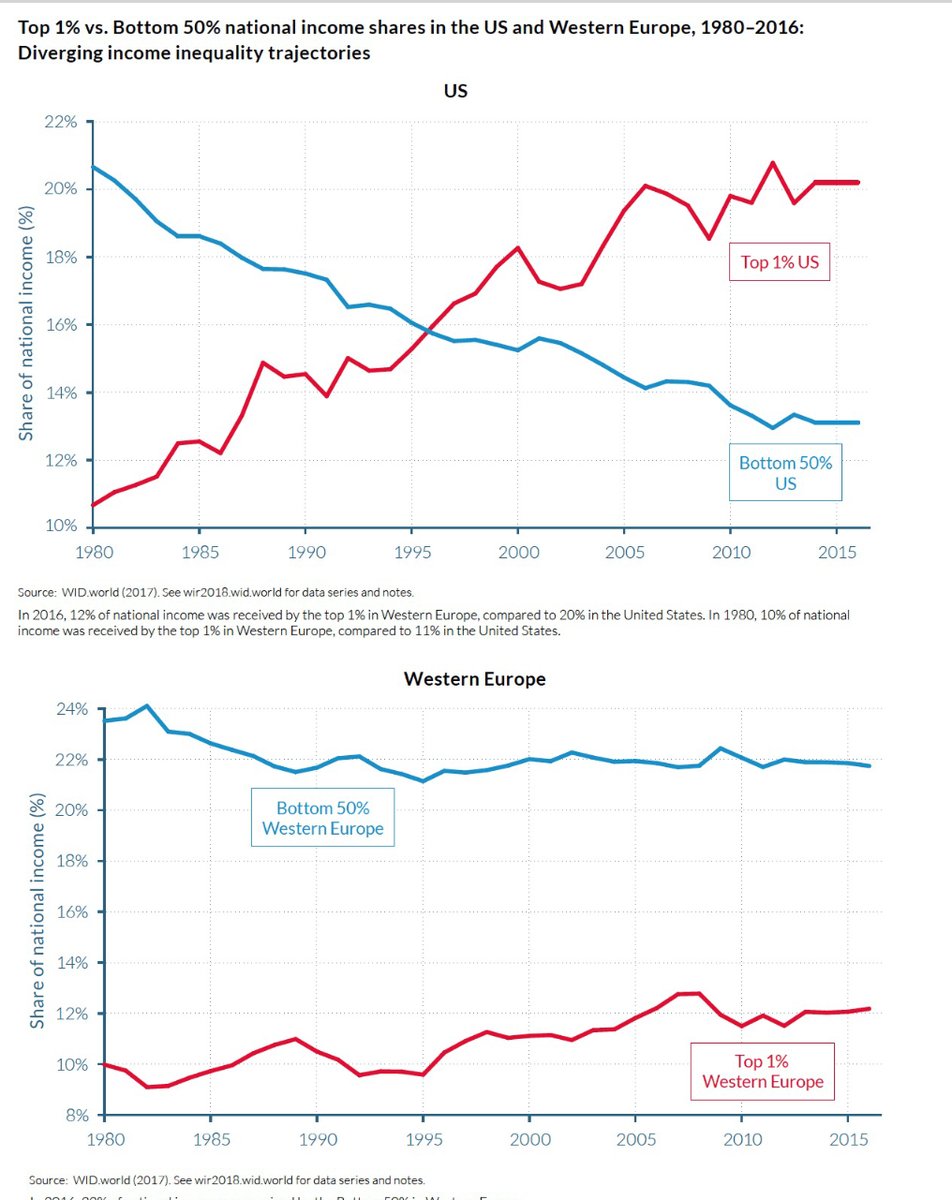
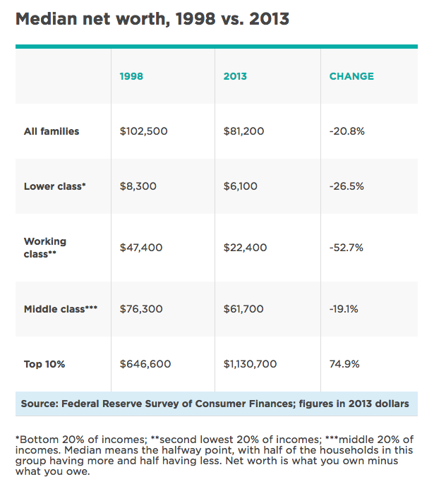
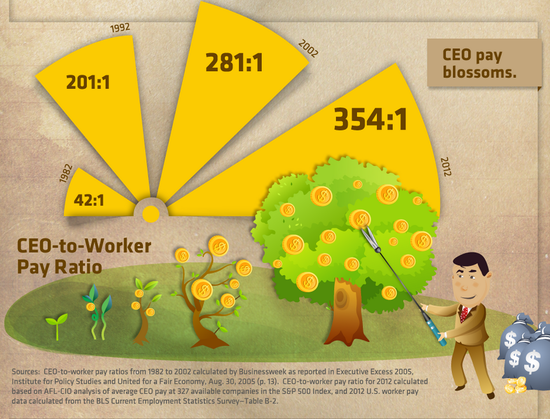
(OK, I know it's not a graph, but you get the idea.)
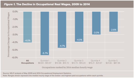
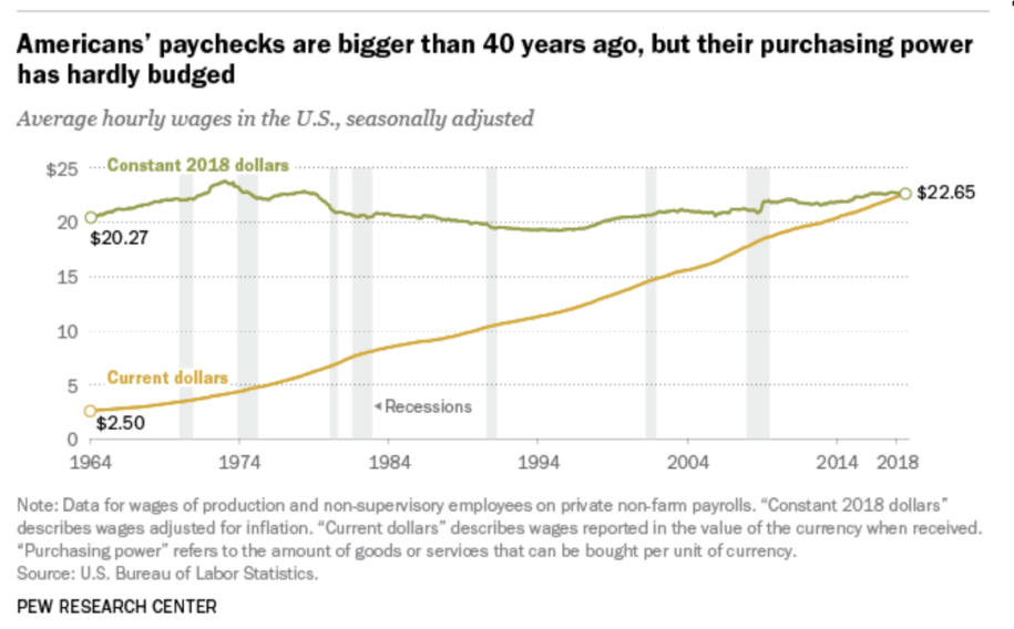
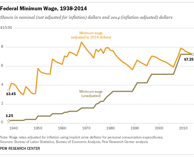
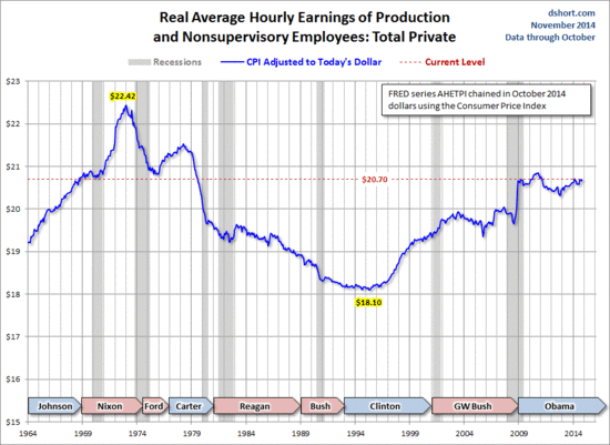
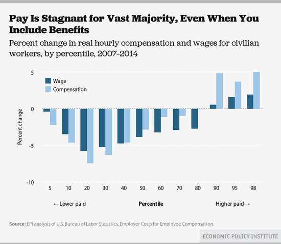
Inflation-adjusted wages have declined since Great Recession,
and worse for low-wage occupations
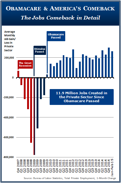
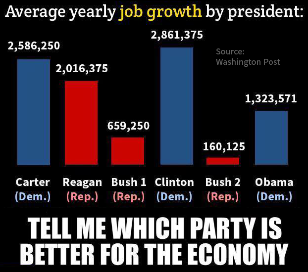
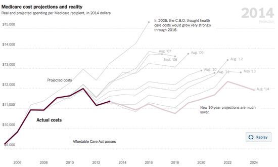
The Affordable Care Act was passed in March 2010 … amid Republican cries that the ACA was a job-killer. It appears Republican were once again dead wrong!
Click to enlarge
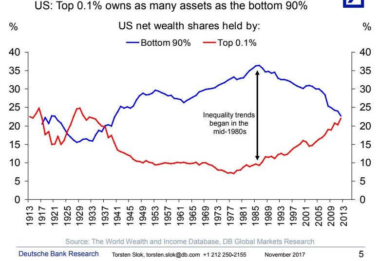
Click to enlarge
The above 2 graphs come from Upworthy
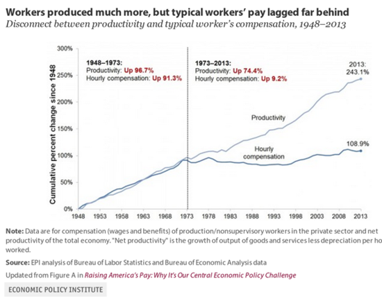
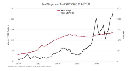
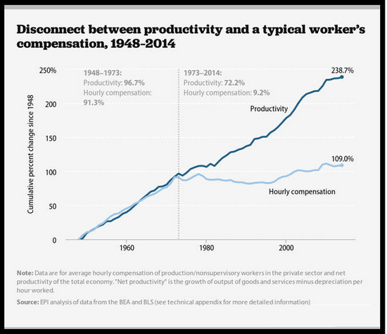
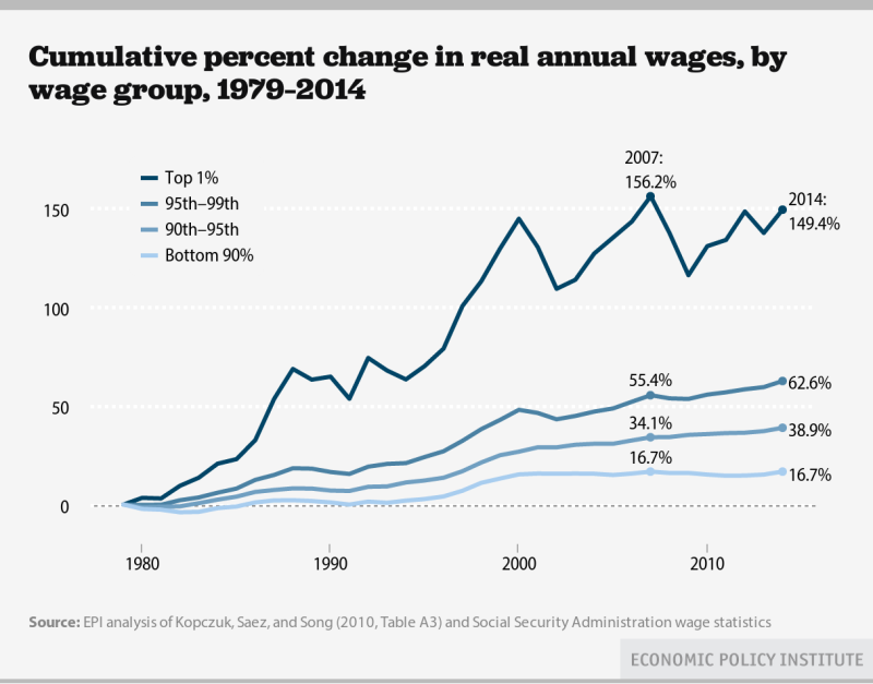
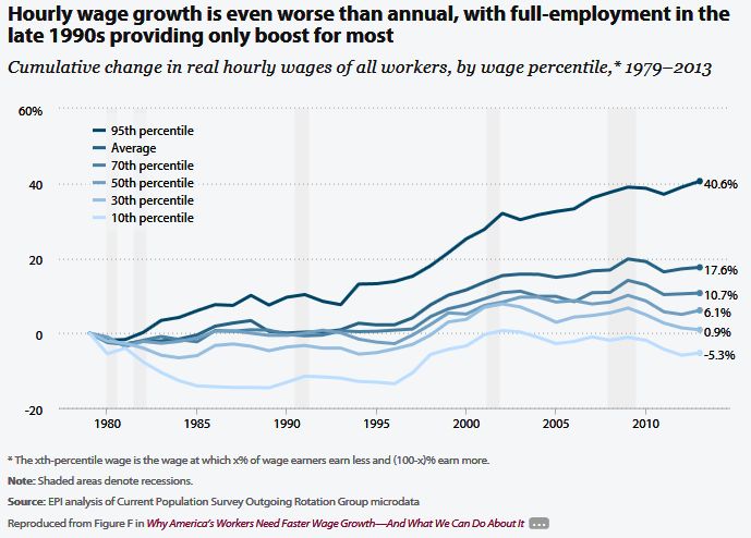
The graph below zooms in on 1973-2014 from the graph above:
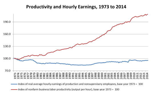
Click to enlarge
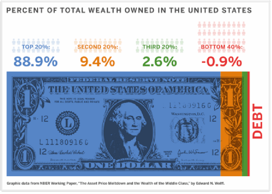
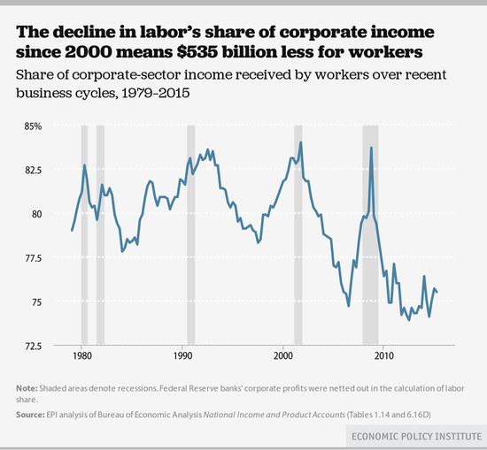
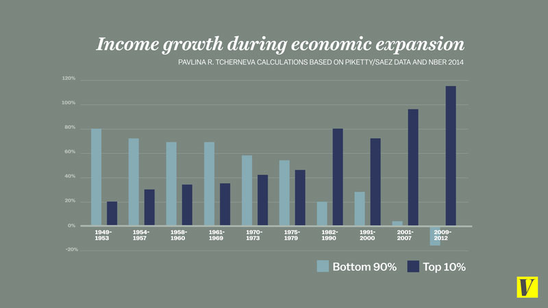
Click graph for more info
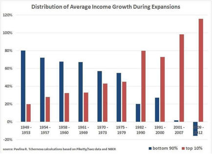
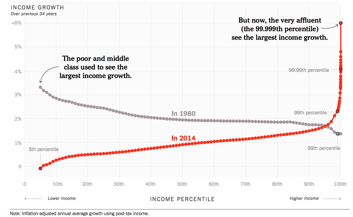
Trickle Down Economics

And Last, But Not Least
15 Ways The United States Is The Best
(At Being The Worst)
Warning: Big Image = 863KB
